

GoCoach Platform Redesign
GoCoach — known as SkillCycle since 2023 — offers a learning and development platform with one-on-one coaching to upskill employees (learners), and performance management tools for HR leaders to measure employee progress and growth.
The focus of this study is the learner experience on the company’s foundational one-on-one coaching platform.

At the Start
When I joined the team in November 2021, the product team was in its early stage of formation, consisting of the Chief of Product & Tech, who also served as the Product Manager, and me as the Product Design Lead. The engineering team was assembled within a couple of weeks after I joined.
A small development team at an EdTech consulting agency had built and maintained the coaching platform since 2018. While this platform sufficiently achieved the business objectives, it didn’t center the end user experience. My objective was to design an intuitive platform experience to increase learner engagement.

Positioning & Pain Points
As the internal engineering team came together, I focused on identifying experiential improvements to the platform.
I began by understanding the positioning of the company in the market, learning about the audience that used the platform, and evaluating the current user experience. The task: Discover opportunity areas through competitive analysis and define the platform’s key pain points for each user role.
I looked at three other coaching platforms — BetterUp, Sounding Board and CoachHub — to gain insight into our strengths and weaknesses in comparison.

It was clear that our greatest advantage was our personalized coaching approach. Unlike competitors who automatically paired learners with coaches based on survey responses, we allowed learners to choose their own coaches by interviewing our on-platform coach community. This empowered learners with more control over their developmental path and ensured they found a coach whose methodology suited their learning preferences.
It was also apparent that we needed to improve our onboarding process to make our users feel supported at the start of their journey, and offer asynchronous learning so they could continue at their own pace.
DEFINING PAIN POINTS
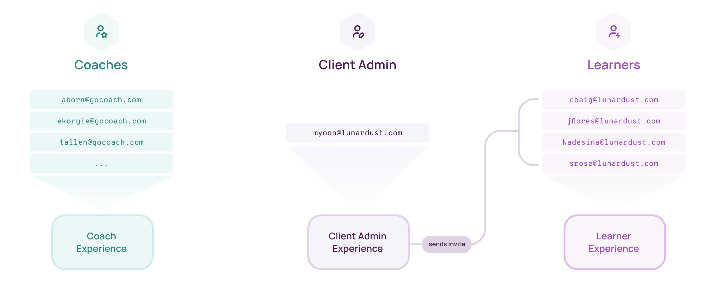
We had three types of users: learners, coaches, and client administrators.
Learners are employees at organizations looking to enhance their professional and personal development skills. Coaches are ICF-certified professionals who provide one-on-one coaching. And Client Administrators are HR leaders at organizations responsible for measuring their learners’ coaching progress and results.
I compiled a list of key facts for each role to better understand their needs and expectations from our platform.

After a heuristic evaluation of the platform and through interviews with coaches (who had previously received coaching through the platform as well) and client admins, I identified these pain points:
Unclear Navigation and Lack of Orientation: Regardless of their role, the platform displayed the same interface for everyone after they logged in: the learner dashboard. Because they weren’t enrolled in any coaching programs as learners, this left coaches and client admins with an unpopulated landing page without guidance on where to go next.

Missing a Meaningful Onboarding Process: Learners received onboarding instructions through a document attached to their welcome email, which was easy to miss, and often required the involvement of our support team to help them get started.
External Coaching Sessions: Coaching sessions were conducted via Zoom, which led to learners only logging on to the platform to schedule or get the Zoom link for their next session. Alongside the sessions, coaches distributed learning materials through email, which was difficult to track when working with multiple learners. And in the case of any missed sessions, our internal support team had to be significantly involved in verifying reasons and restoring those sessions.
Limited Tracking and Metrics: Because sessions were off-platform, client admins had limited insight into their learners’ coaching progress. This made it difficult to measure effectiveness or meaningfully assess the ROI of coaching programs — factors that largely influenced their decision to continue their partnership with GoCoach.
To address these gaps, I developed these solutions as initial platform enhancement goals:

A Slight Change of Plans
By this point, the engineering team had come together — comprising a director of engineering and two engineers — and they conducted a technical review of the platform. Their assessment showed that the current platform architecture was too restrictive to effectively support our long-term product expansion goals. Consequently, the team decided to build a new platform from the ground up rather than attempt to make incremental improvements to the existing platform. The release of the new platform MVP was set for the start of April 2022, about three months away.
This decision required greater effort and more rapid development than we originally anticipated, but it opened up a valuable opportunity for a comprehensive redesign. By rethinking the platform experience from scratch, we were able to strategically tailor experiences for each user role, setting a solid foundation for future growth of contextual modules to meet each role’s specific needs and expectations.
The Learner Experience
While the engineering team began laying the groundwork for the new platform, I mapped out and designed the learner experience. The scope of the platform MVP for learners was their journey from account creation to completion of a coaching program, including the enhancement goals I had outlined.

INTAKE SURVEY
Learners started their journey by creating a GoCoach account after receiving an invitation to their coaching program via email. Then they were presented with an intake survey.
The old platform had a major flaw in its survey: its language misleadingly suggested that survey responses would be used to match learners with coaches; a suggestion that was antithetical to our philosophy. The survey also asked them to select specific skills for coaching right at the start, which again falsely reinforced that their choices here would determine their coach assignment.

I modified the survey to be more transparent by using clear language, simplifying the process, providing explanations where needed, and removing the section about choosing coaching skills. This list would be presented later when learners were ready to search for a coach.

The goal at this stage was only to gather an overview of their current state, which could be used as a jumping off point for conversation with their coach. While the old survey required all survey questions to be answered before moving forward, I removed that obligation to further distance from the notion that survey responses dictated coach selection.
Since learners interviewed coaches before selecting one, the survey was helpful for their selected coach but not a necessity. It was more important that learners began reflecting on these questions as a form of self-assessment in preparation for their coaching journey.
DASHBOARD
After completing the survey, learners were taken to their dashboard. I designed the dashboard to unobtrusively inform, support, and engage learners for a natural introduction to the platform.

Some key features of the dashboard integral to onboarding:
Intuitive Layout: I structured the page to highlight essential information through hierarchy and scale. The coaching session area remained prominently displayed to ensure easy access to session details, and I placed a personalized help section next to it to address any immediate concerns. I also introduced a dedicated Programs section to house a session tracker and notes & resources associated with each program.
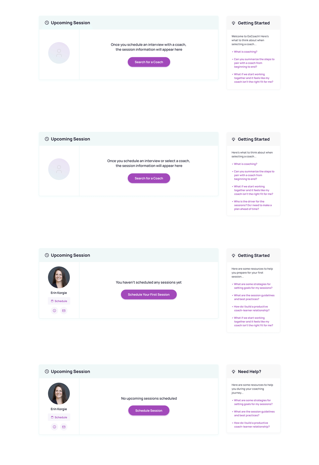
Personalized Help Section: Using a Zendesk integration, we displayed help articles that dynamically adjusted based on the learner’s current stage (new learner, interviewing, or in the middle of a coaching program). This context-sensitive support meant learners received relevant guidance without having to actively seek help. Our support team continually updated these resources to address the most common questions asked at each stage.
Guided Next Steps: The dashboard featured contextual prompts to encourage learners to take their next step. At each stage, I used a prominently positioned button (the visually heaviest interactive element on the page) to direct attention to this action. Initially, the prompt situated learners in the current state of their dashboard while easing them into the next phase of their experience: searching for a coach and scheduling an interview.

COACH SEARCH + INTERVIEWS + SELECTION
Navigating to the coach search for the first time, learners were prompted to select skills for coaching. The list from the the old intake survey now appeared here, but instead of overwhelming learners with a long list, I broke it down into categories based on different areas of focus.
In addition to reducing cognitive load, the intention was to encourage learners to pause for a moment of reflection and exploration before selecting the most impactful developmental path for them.


We defined these categories and skill groupings during a collaborative workshop I facilitated with the head of our coach community and support, marketing, and leadership teams.
After learners selected their focus area and specific skills, we presented them with a curated list of coaches who specialized in those fields, so they could explore coach profiles and schedule interviews.

The old platform displayed all skills as selectable tags above a separate keyword search field. In our new coach search experience, we fused these separated functions into one search bar. Learners could now filter and select skills from a dropdown list or enter keywords to search for matching terms within coach names and bios.

Next, learners viewed coach details to schedule interviews. On the old platform, “Select” and “Interview” buttons were placed side-by-side in the coach card, with “Select” appearing first. This arrangement often caused learners to mistakenly select a coach before scheduling an interview, creating more than a few headaches for our support team.

In the redesigned coach bio, I moved the two buttons inside the detailed view, placed the “Schedule Interview” button at the top in the hierarchy, and disabled* the “Select Coach” button as a helpful constraint until an interview was completed with that coach. This prevented premature coach selection while indicating where to find this action in the future. Once a learner was paired with a coach, unpairing required the involvement of our support team, so it was important to be mindful when selecting a coach.
*Note: Although disabled buttons aren’t generally an accessibility best practice (because screen readers ignore them), applying an aria-disabled attribute enables effective navigation with assistive technology. This attribute allows the button to receive tab focus while signaling to screen readers that it’s inactive. Read more about it here.

I also introduced a feature allowing learners to save coaches they were interested in interviewing. Saved coaches appeared in a new section on the dashboard, making it easy for learners to directly select a coach after completing interviews. All coaches with scheduled interviews were automatically included at the top of this list.
Once paired on the platform, the system also sent a pairing confirmation email and reminded them that our team was available to provide any needed support.

INTEGRATED COACHING SESSIONS
To replace off-platform Zoom calls, the team selected Whereby for embedded video sessions due to its ease of integration with our platform and additional functionality that aligned with our post-MVP roadmap. Whereby included live note-taking (which we could link with our platform’s session-specific notes area down the road) and supported group sessions (a requirement for introducing group coaching in the future).
This integration also made it possible for us to gather valuable data on user behavior, such as the average number of interviews learners conducted before selecting a coach, providing insights we could use to better support and refine the selection process.
SESSION TRACKER
On the old platform, upcoming session information was displayed with a static visual element that noted completed, upcoming, and total number of sessions in a coaching program. There was a series of boxes underneath this section (corresponding to the total number of allotted sessions in the program), each containing a button for scheduling the session.
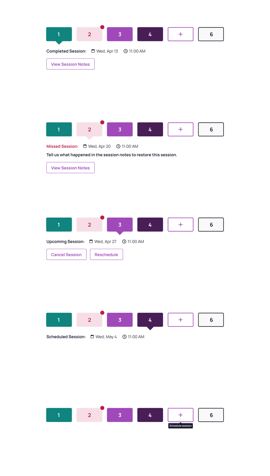
Taking inspiration from these patterns, I designed an interactive session tracker component that showed details of completed, upcoming, or missed sessions, and allowed quick scheduling of new ones.

SESSION NOTES + RESOURCE LIBRARY
Learners could view their notes and resources by clicking on the program name to see program details, or access notes for a specific session through the “View Session Notes” button inside the session tracker component. They could save their notes for personal reference or choose to also share them with their coach for greater continuity and collaboration in their journey.
The “Program Resources” tab housed all additional learning materials uploaded by the coach, providing an asynchronous learning environment where learners could access content at their convenience.
I opted for a tabbed layout on this page in anticipation of post-MVP expansion to include goal tracking and self-assessment tools within a program, enabling learners to easily navigate between existing and future features without overwhelming the interface.

MISSED SESSIONS
Because sessions occurred off-platform in the old system, tracking and verifying missed sessions was a lengthy, inefficient process for our support team. With our new integrated session tracking system, learners directly explained the reason for a missed session in their session notes so the system could restore it.
If the reason involved their coach, the coach was prompted to verify the explanation in their dashboard. Once verified, the session was restored.

This system also made it easy to track any repeatedly missed sessions by an individual, providing a documented basis for a coach to deny restoring a session if it was against their policy. At that time, each coach set and communicated their own rules regarding the permissible number of missed sessions before a session could not be made up.
To take that responsibility off our coaches, we collected missed session data to inform a platform-wide limit post-MVP.
MID-JOURNEY SURVEY + PROGRAM COMPLETION
Halfway through their coaching program, we invited learners to provide feedback on their experience. This feedback gave us qualitative insights that, when combined with the quantitative data on platform usage and program completion, offered a well-rounded understanding of their journey.
After all sessions were completed, the program was marked inactive, but learners retained access to their notes and resources. This way, they maintained their connection to past progress even as they began new programs.
When their client admin invited them to a new program, the process restarted — beginning with a new intake survey and coach interviews.

•:•
Click through the Figma prototype for the step-by-step learner experience I delivered — from account creation to program completion
•:•
MOBILE EXPERIENCE
We recommended that learners participate in their coaching sessions via desktop to help them stay attentive and immersed. To let them access their notes & learning materials and check details of upcoming sessions on the go, we also provided a seamless mobile experience.

•:•
Design Principles
A clear design philosophy is essential for creating consistent and cohesive user experiences. For this project, I adhered to two guiding principles:
1. Providing Unobtrusive & Contextual Guidance
This principle focused on ensuring users received relevant guidance directly within the flow of their experience through contextual prompts and context-sensitive support. Delivering contextual guidance alongside progressive disclosure reduced cognitive load and situated users clearly within the current state of their journey while making them aware of how it would progress.
2. Anticipating Future States
Designing the foundational platform meant keeping future product expansion in mind as well. With this awareness, I designed modular, flexible interface elements that could evolve and expand over time without requiring a complete experiential overhaul.
I also focused on insulating the core user experience from this ongoing expansion. Providing clear visual and contextual cues, offering stage-aware support, and addressing immediate user needs would ensure that the relationship between the user’s experience and the platform’s environment remained consistent — regardless of how the product evolved.
•:•
Looking Back
One significant challenge we faced during this project was that our team was working together for the very first time. Learning and adapting to our individual working styles while delivering the foundational platform under tight time constraints tested our momentum. However, through our collective flexibility and cross-functional collaboration, we successfully launched the new platform MVP and established a solid, scalable foundation for future growth.
•:•
In January 2023, GoCoach rebranded as SkillCycle and launched additional learning and performance management tools alongside 1:1 coaching. While its visual language has been updated to reflect the new brand and product growth, the platform continues to leverage this foundational design strategy of guided, personalized, and contextualized experiences aligned with user roles and expectations.